I wanted to make this post to address and debunk the most common interior design misconceptions. As a designer who has been in the field for over 6 years, I have heard the same interior design misconceptions over and over again. And I don’t blame non-designers for believing these misconceptions, there is some truth to most misconceptions. But I think it’s important to break down these misconceptions further to truly understand why and how they don’t always apply. I don’t like the idea of people limiting themselves and the possibilities for their spaces because of some interior design misconception they hold onto. So, let me break down and debunk the most common interior design misconceptions.
Interior design misconception 1 – dark colours will make a space feel smaller
This is probably the most common interior design misconception. And, honestly, it frustrates me. The reason why it’s so frustrating is that it makes people afraid to add any dark colours into their space. And without these beautiful, deep and rich colours, the space will lack depth and contrast.
Now, let me clarify. Yes, if you paint an entire room black, yes it will feel smaller. But adding some dark elements into a space will not make your space smaller. In fact, depending on how you add the dark elements, it might even make the room feel bigger.
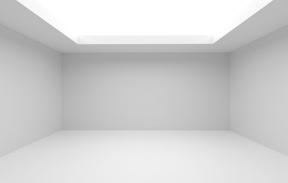
Hear me out. Let’s take a look at this all-white room. I mean, sure, it feels airy and big.
Now let’s look at the same space, but with a dark wall colour on the wall furthest from the entry/focal point (don’t mind my less than perfect photoshop skills). This dark colour actually created the illusion that the wall is further than it actually is, so it actually makes the room feel bigger. Dark colours add depth and contrast which plays with our eye’s perception of space.
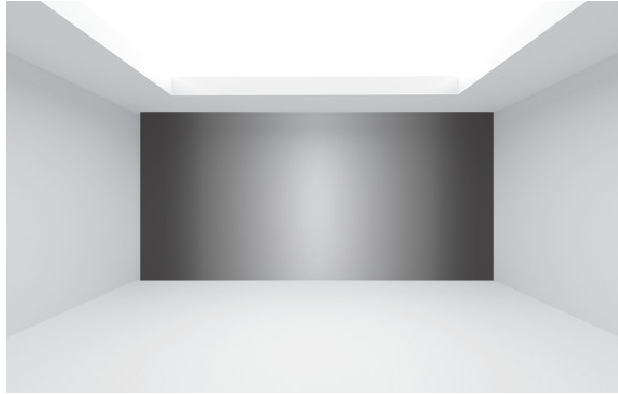
So if you stick with the idea that your whole space has to be light in order to for it to feel bigger, you’re missing out. And in my humble opinion, all white and bright spaces just aren’t that captivating. So, add some dark colours. Bring on the moodiness, coziness and depth.
Neutral colours are more timeless
This is another frustrating interior design misconception because it makes people afraid of adding colour to their spaces! Ugh. And, listen. I can appreciate a good neutral space. As long as the neutral space has plenty of texture, shapes and interest it can be amazing. But, a lot of neutral spaces are just boring. For whatever reason, people seem to think that neutral = timeless. There is some truth to that, but that implies that colour is not timeless. I am here to argue that interiors with plenty colour can be just as timeless as neutral-coloured spaces.
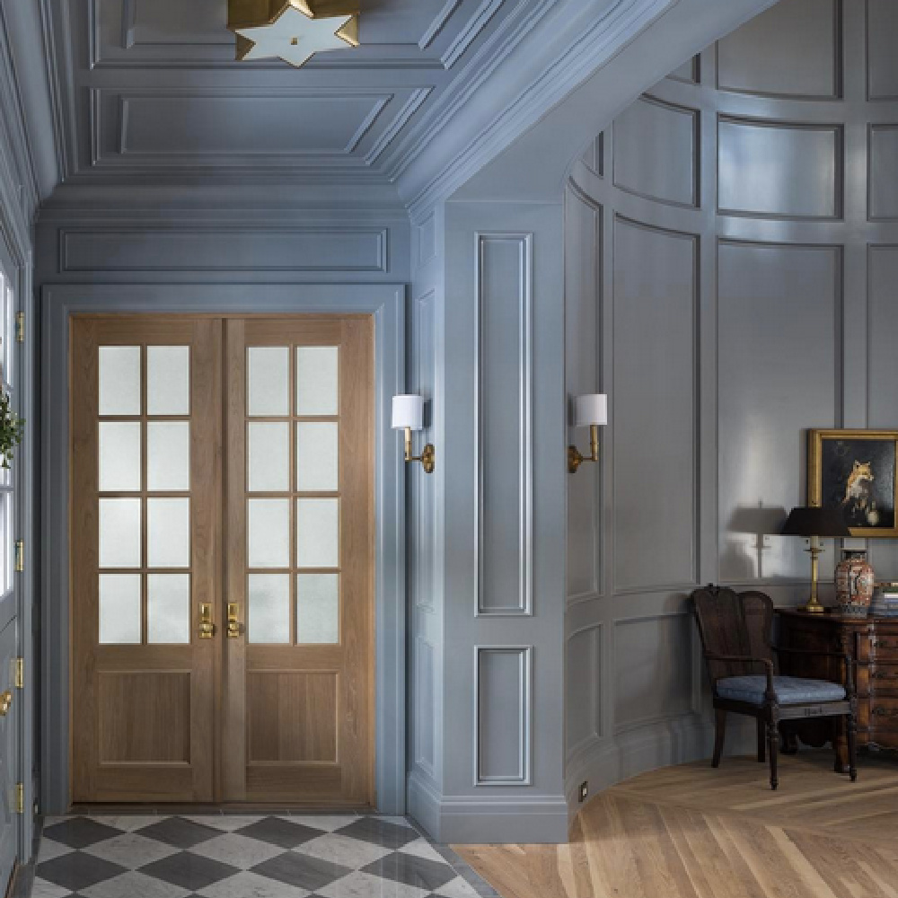
You see when creating a timeless interior, there are far more factors to consider than just the colours. However, in the case of colour, it’s really the balance of warm and cool colours and colour variation that determines whether the space is timeless or not.
If your space is 100% neutral coloured incorperating only similar tones and shades, your space isn’t harmonious or balanced and is in fact not timeless at all. You need a good mix of different shades and tones of various colours in a space to create timelessness.
A simple rule to follow is the good ol’ 80/20 rule. If you want a more neutral space, incorporate 80% neutral colours and 20% more saturated colours to achieve that balance that every interior needs. The 80/20 rule also holds true for balancing the cool and warm colours in an interior.
So, you should add some colour into your all neutral space now that you no longer believe in this interior design misconception.
You cannot mix metals
I don’t know why, but I’ve come across a lot of people who are turned off by the idea of mixing metals. I always thought this was funny because people are okay with mixing colours and wood tones but for some reason when it comes to metals, they think it needs to be matchy-matchy. It’s just simply not the case. You can certainly mix metals just as you mix colours and other materials. You can find all different types of metal finishes including; chrome, brushed nickel, polished nickel, gold, brass, copper, stainless steel… etc. My advice would be to pick a couple of metals to incorporate into your space. My favourite metal finish pairing would be polished nickel and black.
Some people even believe all the finishes/colours/styles need to be matchy-matchy in an interior. When a space is too matchy-matchy it can lack character, definition and depth. Think of those 2000’s matchy-matchy bedroom sets…when all the furniture in the entire space looks exactly the same there is nothing interesting that holds your attention. It’s very cookie-cutter. So, don’t fall into this interior design misconception, embrace mixing metals, styles and colours!!
Decorating is expensive
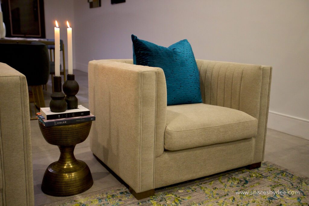
Listen, decorating CAN be very very expensive. The sky is the limit when it comes to decorating and furnishing. But, I want to debunk this interior design misconception and say that decorating doesn’t HAVE to be expensive. Dressing an interior is very similar to dressing yourself or someone else. Sure, you can spend thousands of dollars on an outfit and look great very easily. But I also have seen people pull together an outfit for $24.98 and look great as well, granted, this is a bit more difficult. The point is, dressing an interior or yourself for cheap takes some skill and creativity BUT is possible.
Some tips…
Use what you already have in new ways, shop second hand and tap into your own unique sense of style. Now, I’m a designer and have impeccable style and taste, lol (I’m also very humble as you see). So honestly, this is easy for me to say. But, the point I’m trying to make is that decorating doesn’t have to be expensive.
If you don’t have the creativity it takes, I would say find a designer you like and allow them to get creative with your budget for you.
And there you have it, I have debunked the most common interior design misconceptions!
Let’s design your space together, virtually.
