As a designer, it’s become apparent that people look like their homes. It’s kind of like how plenty of people look like their dogs. People tend to gravitate towards the same type of vibe in all their aesthetic choices. So, I thought it would be fun to take a look at some TV characters and match them to the interior spaces that I think they’d live in.
When it comes to TV and movies, I tend to gravitate towards older stuff. I realized it’s because it gives me such a sense of comfort and nostalgia. It feels homey, it feels real and reminds me of simpler times. Now, I was born in the mid-90s, so I am not that old, but I surely am an old soul and love to rewatch older TV shows.
Ms. Frizzle from The Magic School Bus as an Interior Space

Ms. Frizzle is fun, bold, playful and coordinated. Her interior space would surely reflect that. You wouldn’t catch her with grey flooring or cheap Homesense art on the wall. You’d catch her in a space like this:
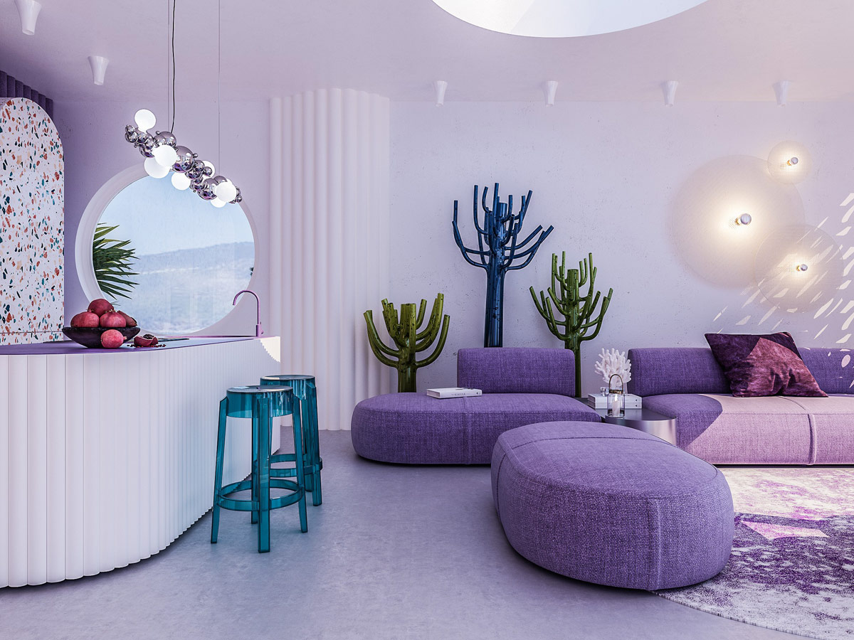
Now, tell me this doesn’t make sense. This interior space screams personality, like Ms. Frizzle.
Rachel from Friends as an Interior Space
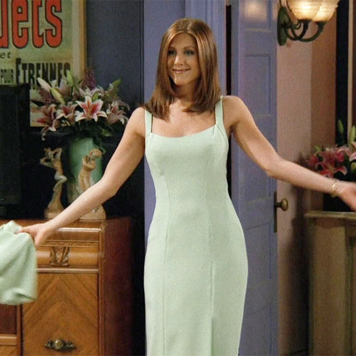
Now, Rachel lived with and in Monica’s space. So, I can’t really say the show depicted Rachel’s style within the space. Rachel’s style was classy, feminine and on-trend (for that time and even now). So, I imagine her interior space to be stylish, girly and well out together.

This is the vibe that best matches what I think she would gravitate to. Maybe this space is a little too bougie (she stopped taking Daddy’s money), but hey, you get the overall look.
Carlton from The Fresh Prince of Bel Air as an Interior Space
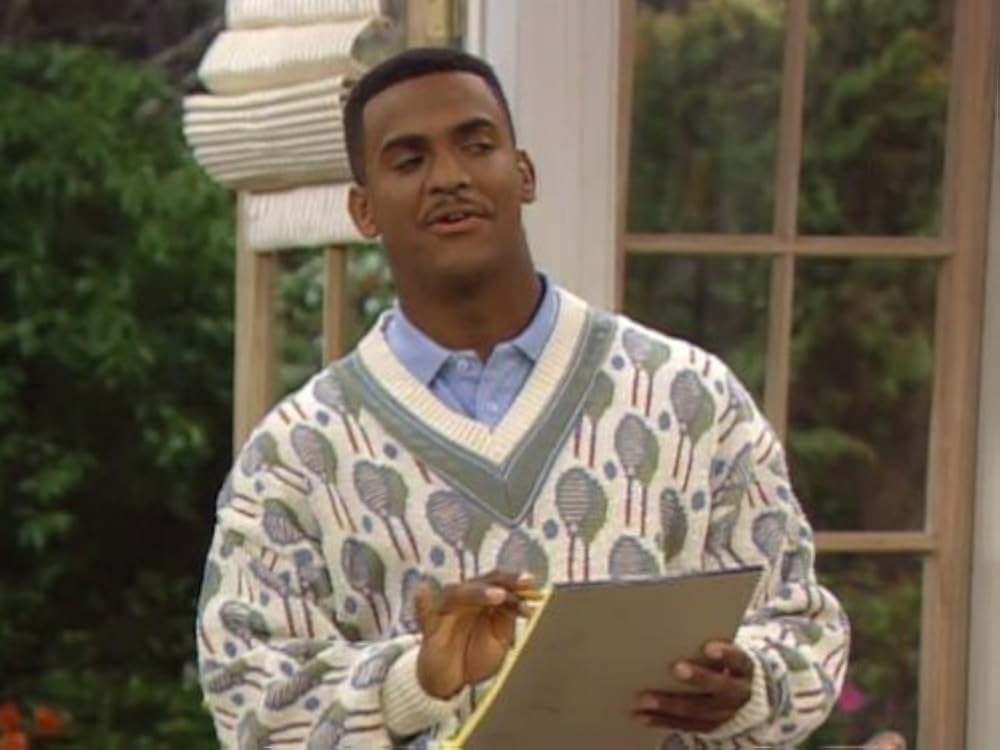
Carlton from The Fresh Prince of Bel Air was very distinguished, smart and preppy. His interior space would definitely be very bougie. The Bel Air house was very fancy and over the top, which already depicts Carlton’s style well. But if we are bringing it to the modern age, I could imagine him in a space like this:

This space is like a slight style upgrade to the Bel Air mansion.
Bubbles from The Powerpuff Girls as an Interior Space

Bubbles is well, bubbly. She has that personality that lights up a room and brings in the spunk. So, I can see her in a bright space with pops of colour (mostly yellow and blue…lol), with plenty of organic shapes. Something like this:

Now, this is a fun and bubble space if I’ve ever seen one.
Stifler’s Mom in American Pie as an Interior Space

Now, this character was made to have a lot of appeal…lol, let’s put it that way. She’s brash, mysterious and sexy. So, it’s only fitting that her interior space matches.

Now, this is the type of sexy space that matches a cougar like her. That’s a tiger, yes I know. Read Sensual Spaces: How to Create a Sexy Interior.
90s Interior Space Distinctions
Now that we had some fun matching 90s characters with interior spaces…let’s break down what makes an interior 90s.
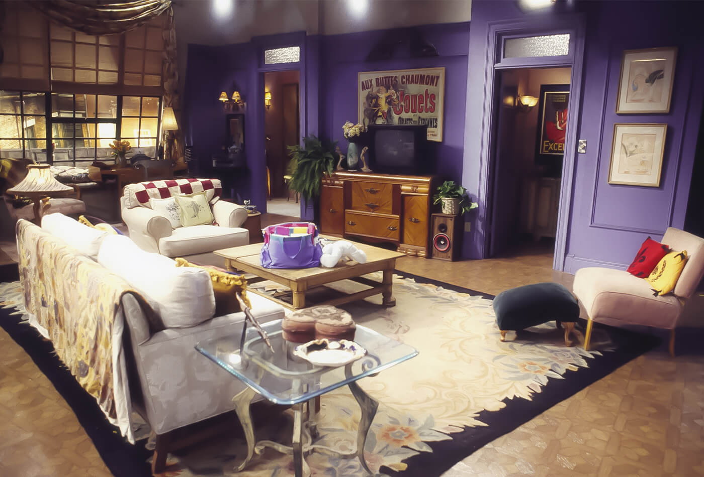
The interiors of the 1990s were characterized by an eclectic mix of bold choices, casual comfort, and a fusion of various styles. Marked by the transition between the excessive trends of the 80s and the more minimal aesthetics of the early 2000s, 90s interiors embraced individuality, with homeowners and designers experimenting with vibrant colours, unique textures, and eclectic decor. Here’s a breakdown of the elements that made up quintessential 90s interiors.
90s Colour Palettes and Patterns

The 90s saw a distinct shift from the neon brights of the 80s to more subdued but still rich tones. Popular colour palettes included deep forest greens, burgundy, mustard yellows, and navy blues, often paired with beige, white, and taupe for a balanced look. Pastels like mint green, soft peach, and lavender also made their way into many homes, especially in bedrooms and kitchens. Walls were frequently painted in soft, neutral tones but accented with bold patterns, including florals, geometric shapes, and abstract designs. Wallpaper was a staple during this era, with everything from traditional florals to quirky, textured designs.
90s Furniture and Materials

The 90s favoured comfort over formality, resulting in overstuffed couches, oversized chairs, and sectionals dominating living rooms. The rounded edges and bulky proportions of furniture reflected a laid-back lifestyle. Leather and microfiber were popular upholstery materials, with leather sofas in dark tones like green, burgundy, and brown becoming ubiquitous in family rooms and dens. Wooden furniture, particularly oak and pine, remained a favourite for dining tables, coffee tables, and cabinets.
One hallmark of 90s interiors was the use of light or whitewashed wood finishes, adding a bright, airy feel to spaces. Wicker and rattan furniture, especially in sunrooms and patios, were also very trendy, giving homes a casual, earthy vibe. Another distinctive feature was the frequent use of glass, whether in coffee tables, dining tables, or shelving, lending a modern, sleek touch to interiors.
90s Decor and Accessories
Decor in the 90s was often about blending traditional elements with contemporary flair. Framed prints, wall art, and tapestries were common, often depicting natural landscapes, abstract patterns, or culturally inspired motifs. Mirrors, with their ability to make spaces look larger, were another popular accessory, often framed in ornate or metallic designs.

The influence of global cultures was apparent in the form of eclectic accessories and decor. Many homes incorporated Southwestern motifs, with Native American patterns, terracotta tiles, and cacti becoming key design elements. The rising popularity of minimalism also encouraged the use of metal and glass, along with decluttered spaces that favoured form and function.
Technology and Entertainment Spaces

The 90s also marked a significant shift in how homes integrated technology. Bulky televisions and entertainment systems became the centrepiece of living rooms, leading to the rise of entertainment centres. Large cabinets and wall units were designed to house not only TVs but also VCRs, stereos, and growing collections of VHS tapes and CDs.
90s Flooring and Lighting
Carpet, especially in soft, neutral tones, was popular in many homes, though hardwood floors were also common. Tile flooring in kitchens and bathrooms often came in bold, geometric patterns or simple monochromatic schemes. Lighting in the 90s embraced function, with recessed lighting, floor lamps, and track lighting adding an element of modern sophistication to spaces.
In summary, 90s interiors were a blend of casual comfort, bold colours, and eclectic elements. They reflected a time when personal style reigned, allowing people to experiment with both traditional and modern design cues, resulting in homes that felt both lived-in and stylish
Xo, a 90s baby.
Click Here To Shop My Favourite Home Goods
Let’s design your space together, virtually.
