Color drenching — or colour drenching, depending on where you are in the English-speaking world. I’ve always found it funny that we couldn’t just agree on one spelling for certain words. That said, I’m Canadian(ish), so I typically go with the “U.” But, seeing as most of my readers are down south, I’ll go ahead and annex the U — just this one time. So, back to the topic of color drenching, it’s one of the most popular interior design trends people are talking about these days. So, I thought I would get in on the action.
What’s Color Drenching?
Well, color drenching is essentially a bold take on a monochromatic color scheme — but with a specific focus on paint. The idea is to use one color (or variations of it in different shades or tones) and apply it across the walls, trim, ceiling, and sometimes even the doors and radiators.
It creates an immersive, cocoon-like effect that adds depth, drama, and cohesion to a space. Whether you’re working with a soft neutral or a rich, saturated hue, color drenching can make a room feel intentionally designed and beautifully layered — all without the need for a complex palette.
It’s a striking yet surprisingly versatile approach to color that can work in both modern and traditional interiors, depending on how you style the rest of the space.
Why Color Drench?
:max_bytes(150000):strip_icc()/MaryPattonDesign-InteriorDesign05-1ea0a24f6a7741b79fca11105b06a4f1.png)
Color drenching creates an instant mood. By wrapping a room in one hue — from walls to ceiling to trim — you create a seamless, immersive environment that feels intentional and elevated. It can make small rooms feel cozy and dramatic, or add depth and sophistication to larger spaces. Whether you go bold or stay neutral, this technique brings a sense of cohesion and design confidence that’s hard to ignore. It’s one color, done all the way — and the impact is anything but one-note.
Color Drenching For Small Spaces
I like color drenching for small spaces. It actually reminds me of a project from a few years ago when I was redesigning a tiny bathroom for a client. That’s when it hit me — the public is obsessed with trying to make small spaces feel big. And honestly? I don’t really get it.
Sure, having a big space is nice, but some rooms are just meant to be small. Instead of fighting it, I say lean into the coziness. Color drenching is the perfect way to do that — it brings a dramatic, sexy, and enveloping vibe that enhances the charm of a small space, rather than pretending it’s something it’s not.
How To Decide On a Color To Drench
Color drenching seems easy, right? Just pick a color and go all in. But honestly, that might be the biggest challenge — is there a color you won’t get tired of seeing everywhere?
So, how do you even begin to choose? I’ve got a few tips to help. First, ask yourself: Are there any colors you consistently love when you see them in interiors? For me, I’m drawn to burgundy, plums, burnt oranges, and rich blues.
From there, it becomes a matter of figuring out which one I could live with every single day — the one I wouldn’t get sick of after a week. That’s your starting point.
There’s also the question of what colors actually work well together. Chances are, you’re not changing your flooring and you’ll likely want to layer in a few accent colors, too. That’s where the real discovery begins: building a cohesive color palette that complements what’s already in the space, while still letting your main hue shine.
So, first determine which colors you won’t get tired of, then start building a complementary color palette for the rest of the space.
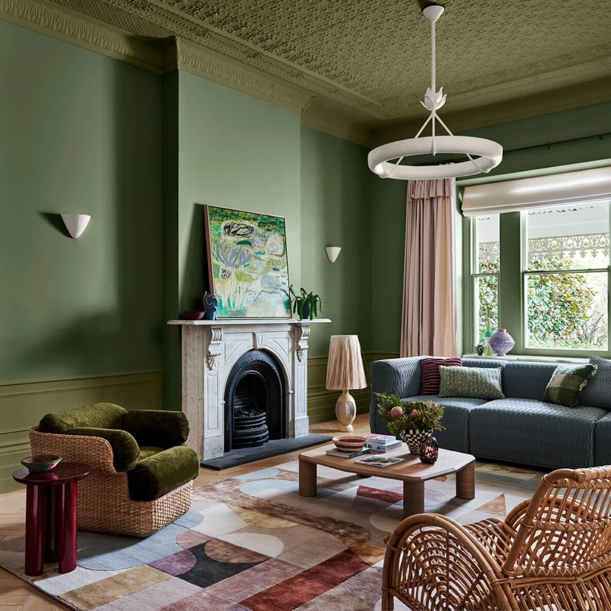
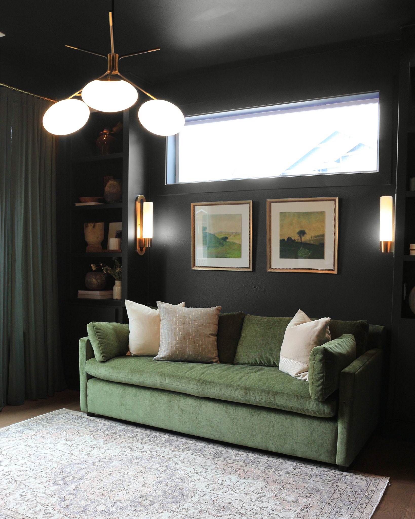
Inspiration For Color Drenching
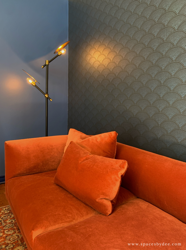
Maybe you need to be inspired. Maybe you’d never considered color drenching until now. Well, here you go, some super stunning interiors to inspire your own project.

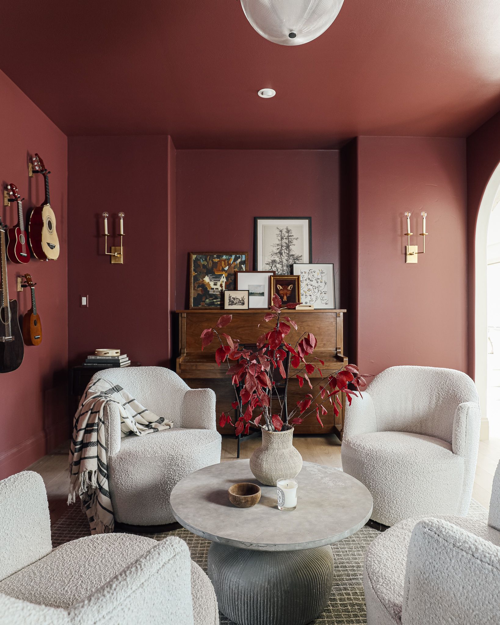

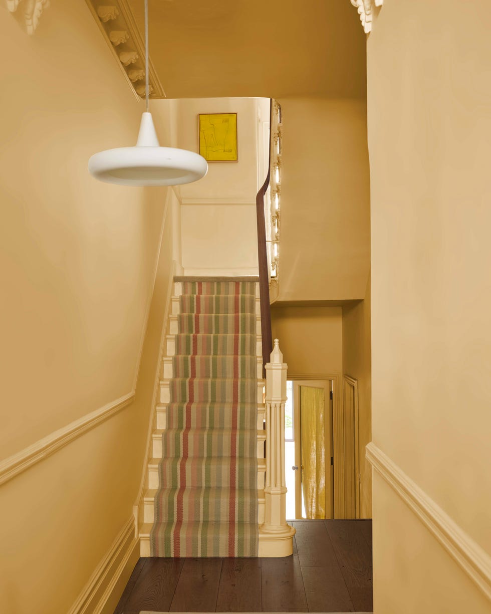
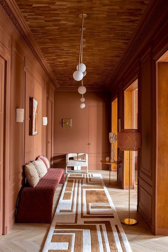
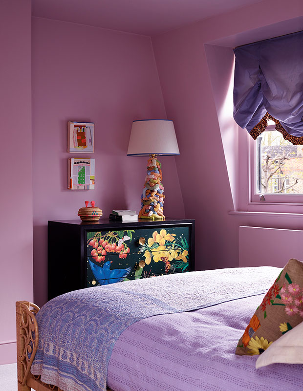
Gorgeous. I seriously dream of the day I color drench my room in burnt orange or burgundy.
My Favourite Paint Shades to Colour Drench With
Okay, firstly, I just wanted to point out that there’s a company that offers paint DELIVERY, isn’t that so cool?! It’s called Clare.
Anyways, here are some of my favourite colors for you to consider for your color drenching project:
Sherwin William Color Drenching Selections
Revel Blue is a stunner! I will insert a photo of a family room I used it in.
I also love Cordial it’s a stunning burgundy shade I recently used in a closet. See on my Instagram here.
Lotus Flower is a stunning light pink shade.
Greenfield is a gorgeous earthy green.
Truepenny is a sexy orange.
Spiced Cider is a sexy cinnamon color.
Benjamin Moore Color Drenching Selections
Lazy Sunday is a blue that everyone loves.
Polar Jade is such a unique green-blue.
Hudson Bay is a deep blue I love and used on this accent island.
Texas Rose is a stunning dusty rose color.
Jasper Yellow is a lovely yellow I can see working well in a nursery.
Will Color Drenching Go Out Of Trend?
Trends come and go, but color drenching taps into something more timeless: mood, atmosphere, and personality. While the specific shades may shift with the seasons (hello, trending greens and browns), the technique itself has staying power. Why? Because it’s versatile, bold, and rooted in classic design principles. So even if the buzz quiets down, color drenching isn’t going anywhere — especially for those who love a space that feels intentional and immersive.
But, as always, I tell people to ditch following the trends and follow what makes them happy in their own interior. So, maybe that means color drenching and maybe it doesn’t. It’s important to get in touch with your own style and not case trends.
If you’re still confused about color drenching and decorating your space, I can help you out. Let’s connect.
Click Here To Shop My Favourite Home Goods
Let’s design your space together, virtually.

Leave a Reply